Wednesday, May 11, 2011
Museum Project
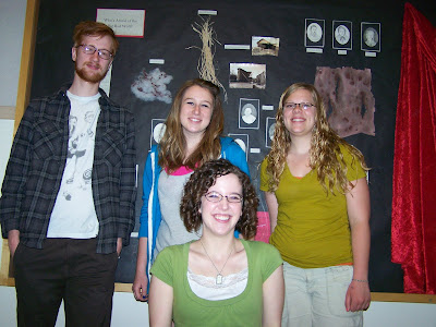
So since I'm kind of ashamed over my last couple artist posts, I'll end with something I'm not ashamed of: our last big project!
Assigned to create a museum exhibit, my group decided to create an exhibit on the court case for the Big Bad Wolf. Though we originally were going to set the case in "fairy tale land," eventually we decided to concoct a story about a real-life serial killer who inspired the three fairy tales.
Here's our project proposal:
My group was awesome. Jordan gathered physical evidence and destroyed grandma's nightgown. Ammie altered photos and designed/printed/transfered the newspaper template. Cory drew portraits and court drawings, and I composed newspaper articles, our introduction, and our concluding statements as well as printed and cut out all the tags for the exhibit. I think things came together pretty nicely!


Assigned to create a museum exhibit, my group decided to create an exhibit on the court case for the Big Bad Wolf. Though we originally were going to set the case in "fairy tale land," eventually we decided to concoct a story about a real-life serial killer who inspired the three fairy tales.
Here's our project proposal:
Installation Proposal for Anne-Marie Kottenstette, Jordan Munroe, Cory McCormick, and Kate Huebschmann
Concept
In our culture, the Big Bad Wolf is instantly recognized as an embodiment of evil, but that recognition indicates more about us than we would originally think about. This piece will depict the way in which a sense of law and justice is instilled in us from an early age. Fairy tales act as ways of providing a moral foundation for society by shaping children’s ideas of what is right and what is wrong. By taking what originally belongs in the realm of childhood and transferring it into a setting that is generally associated with adults, the piece provides a visual link between our upbringings and our cultural morality.
Elements to Include
This piece will depict a historical record of the trial of the Big Bad Wolf. Group members will create evidence or historical documentation such as crime scene photos, physical evidence (remnants of Grandma’s nightgown, debris from the Three Little Pigs’ homes, etc.), court drawings, testimonies and portraits of victims or witnesses, headlines from newspapers, or anything else we decide to include.
The piece will reference the following fairy tales:
· Red Riding Hood
· Three Little Pigs
· Peter and the Wolf
· Boy Who Cried Wolf
Installation
All evidence, court drawings, and documentation will be located in one vitrine. Our artists’ statement will appear as the court case’s opening statement on the vitrine’s left side. The court case will be presented left to right with the final verdict appearing at the far right. Evidence from each fairy tale will be presented in order of “occurrence” with all physical evidence being displayed at the front of the case and all drawings and photographs mounted along the back of the case.
Possible Items Needed
· Paper
· Camera
· Tags
· Dirt
· Basket w/flowers
· Red fabric/cape
· Hay/sticks/bricks
· Cloth/clothing
· Wallpaper with red paint
· Feathers
· Wool
My group was awesome. Jordan gathered physical evidence and destroyed grandma's nightgown. Ammie altered photos and designed/printed/transfered the newspaper template. Cory drew portraits and court drawings, and I composed newspaper articles, our introduction, and our concluding statements as well as printed and cut out all the tags for the exhibit. I think things came together pretty nicely!


Featured Artist: Florian Maier-Aichen
Again, I'm sorry it's so short.
Florian Maier-Aichen’s images offer reinterpretations of traditional landscape photography. Often shot at obscure angles or from aerial views, he represents sites in a way that makes the viewer feel slightly dislocated, addressing ideas of globalization and virtual perception. This dislocation is multiplied by the computer enhancement he performs on the photos, heightening the images’ tension. Replacing classical landscapes with futuristic scenes, Maier-Aichen takes the romantic idea of the sublime and places it within the context of modern day life and experience.
Though photography is inherently considered a “documentary” art form, Maier-Aichen approaches it as a way of creating illusion. Fact and fiction are indistinguishable in his pictures, creating an impression of constant change.

Untitled, Print, 2005

Untitled, Print, 2005
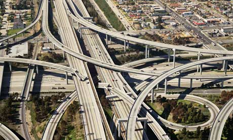
Untitled (Freeway Crash), Print, 2002

Untitled, Print, 2005
Florian Maier-Aichen’s images offer reinterpretations of traditional landscape photography. Often shot at obscure angles or from aerial views, he represents sites in a way that makes the viewer feel slightly dislocated, addressing ideas of globalization and virtual perception. This dislocation is multiplied by the computer enhancement he performs on the photos, heightening the images’ tension. Replacing classical landscapes with futuristic scenes, Maier-Aichen takes the romantic idea of the sublime and places it within the context of modern day life and experience.
Though photography is inherently considered a “documentary” art form, Maier-Aichen approaches it as a way of creating illusion. Fact and fiction are indistinguishable in his pictures, creating an impression of constant change.
Untitled, Print, 2005
Untitled, Print, 2005
Untitled (Freeway Crash), Print, 2002
Untitled, Print, 2005
Featured Artist: Philip Guston
So I was celebrating that I had the official 8 artists in when I realized I never put in the missing two from last time. I'm utterly and completely out of descriptive creativity, thus these won't be nearly as detailed as my other entries. Will be "borrowing" a lot of info too. I'm sorry! :(
Philip Guston began his career painting scenes of social issues before becoming well known for his work in Abstract Expressionism, which often depicted blocks, masses of gestural strokes, and marks of color. During the 1960-70s, Guston returned to representational painting, though this time his characters were stylized, abstracted, cartoonish.

To BWT, Oil on canvas, 1952
“The upheavals of 1960s made Guston increasingly uncomfortable with abstract painting, and his work eventually developed into the highly original cartoon-styled realism for which he is now best known. This took him back to his early years - to the style of the comics he loved as a boy, and to the imagery of Klansmen that he first explored in the 1930s.”

Bad Habits, Oil on canvas, 1970
“These images are [often] populated by enigmatic hooded figures, reminiscent of members of the Klu Klux Klan; they are not meant to directly reference racism but rather to take a stand against war, injustice, and the hypocrisy Guston witnessed in American politics. During the years before his death in 1980, Guston continued to hone this imagery, creating increasingly enigmatic compositions reminiscent of still lives or spare landscapes, with clusters of figures, heavy boots and tools, and cycloptic heads” (http://www.theartstory.org/artist-guston-philip.htm)

Edge of Town, Oil on canvas, 1969

Head and Bottle, 1975
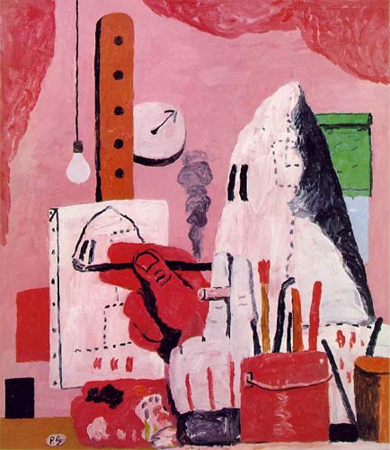
The Studio, Oil on canvas, 1969
Philip Guston began his career painting scenes of social issues before becoming well known for his work in Abstract Expressionism, which often depicted blocks, masses of gestural strokes, and marks of color. During the 1960-70s, Guston returned to representational painting, though this time his characters were stylized, abstracted, cartoonish.
To BWT, Oil on canvas, 1952
“The upheavals of 1960s made Guston increasingly uncomfortable with abstract painting, and his work eventually developed into the highly original cartoon-styled realism for which he is now best known. This took him back to his early years - to the style of the comics he loved as a boy, and to the imagery of Klansmen that he first explored in the 1930s.”
Bad Habits, Oil on canvas, 1970
“These images are [often] populated by enigmatic hooded figures, reminiscent of members of the Klu Klux Klan; they are not meant to directly reference racism but rather to take a stand against war, injustice, and the hypocrisy Guston witnessed in American politics. During the years before his death in 1980, Guston continued to hone this imagery, creating increasingly enigmatic compositions reminiscent of still lives or spare landscapes, with clusters of figures, heavy boots and tools, and cycloptic heads” (http://www.theartstory.org/artist-guston-philip.htm)
Edge of Town, Oil on canvas, 1969
Head and Bottle, 1975
The Studio, Oil on canvas, 1969
Tuesday, May 10, 2011
Featured Artist: Shigeo Fukuda
And now for something completely different...
Japanese graphic artist and designer, Shigeo Fukuda, enjoyed using visual contradictions, illusions, and abnormal combinations of objects in his works of art, which ranged from posters to complex sculptures.
Fukuda's sense of moral responsibility is shown through his posters, addressing social causes such as pacifism and environmentalism. His most famous poster, Victory 1945, depicts a cannon barrel with its shell pointing downward, back towards the barrel, sealing it forever. The simple design offers a biting criticism of the pointlessness of war.

Victory 1945, offset process, 1975
Though his posters are beautiful, I find Fukuda’s illusionistic art to be more fascinating. His work spans both two-dimensional and three-dimensional mediums including impossible objects, ambiguous sculptures, distorted projections, and anamorphic art.
He once described his philosophy this way: "I believe that in design, 30% dignity, 20% beauty and 50% absurdity are necessary. Rather than catering to the design sensitivity of the general public, there is advancement in design if people are left to feel satisfied with their own superiority, by entrapping them with visual illusion."

Constructed out of 848 forks, knives, and spoons, Lunch with Helmet On appears to be a formless object until a light is shone behind it from a certain angle. Suddenly the impossible shadow of a motorcycle appears out of the chaos.

Lunch with Helmet On, Knives, forks, and spoons, 1987
Similarly, his Duet was a structure which looked like a pianist from one angle and a violinist from another.

Duet
Fukuda also created structures based on M. C. Escher’s lithograph prints, which distorted space and perspective to create “impossible objects” which could not exist in three dimensions. An example of this was his Disappearing Column a three-dimensional rendering of the famous impossible trident.

Disappearing Column, Sculpture in wood, 1985
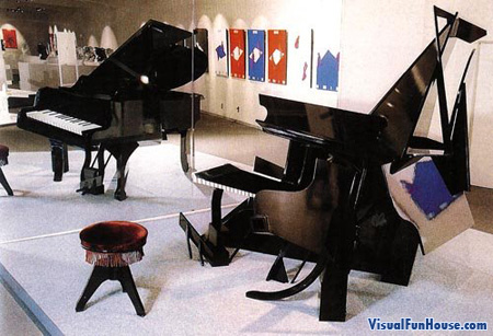
Taking advantage of an Ames Projection, Fukuda has constructed a bizarre piano so that the lines of it still coincide with the lines of sight of a real piano. Seen from one special angle, the reflection of the physical model looks perfectly normal.
Japanese graphic artist and designer, Shigeo Fukuda, enjoyed using visual contradictions, illusions, and abnormal combinations of objects in his works of art, which ranged from posters to complex sculptures.
Fukuda's sense of moral responsibility is shown through his posters, addressing social causes such as pacifism and environmentalism. His most famous poster, Victory 1945, depicts a cannon barrel with its shell pointing downward, back towards the barrel, sealing it forever. The simple design offers a biting criticism of the pointlessness of war.
Victory 1945, offset process, 1975
Though his posters are beautiful, I find Fukuda’s illusionistic art to be more fascinating. His work spans both two-dimensional and three-dimensional mediums including impossible objects, ambiguous sculptures, distorted projections, and anamorphic art.
He once described his philosophy this way: "I believe that in design, 30% dignity, 20% beauty and 50% absurdity are necessary. Rather than catering to the design sensitivity of the general public, there is advancement in design if people are left to feel satisfied with their own superiority, by entrapping them with visual illusion."
Constructed out of 848 forks, knives, and spoons, Lunch with Helmet On appears to be a formless object until a light is shone behind it from a certain angle. Suddenly the impossible shadow of a motorcycle appears out of the chaos.
Lunch with Helmet On, Knives, forks, and spoons, 1987
Similarly, his Duet was a structure which looked like a pianist from one angle and a violinist from another.
Duet
Fukuda also created structures based on M. C. Escher’s lithograph prints, which distorted space and perspective to create “impossible objects” which could not exist in three dimensions. An example of this was his Disappearing Column a three-dimensional rendering of the famous impossible trident.
Disappearing Column, Sculpture in wood, 1985
Taking advantage of an Ames Projection, Fukuda has constructed a bizarre piano so that the lines of it still coincide with the lines of sight of a real piano. Seen from one special angle, the reflection of the physical model looks perfectly normal.
Featured Artist: ROA
ROA is street artist renowned for his fascinatingly detailed spray paint art featuring black and white animals that can be found inhabiting cities all over the world, all in varying stages of decay. To some, using public spaces as canvases is vandalism, simple defacement of property. Others see ROA’s work as refreshing, unrestrained by financial gain or institutional demands.

He seems to find inspiration in adversity, choosing to depict animals that get overlooked, yet persevere despite man’s determination to destroy. Giant black and white ant eaters, enormous rats, decaying rabbits, skunks, ferrets, sloths, raccoons and birds constitute much of ROA’s repertoire, yet something feels slightly odd about his depictions, something that gives them an edge. “Even when they appear cuddly there is something beneath them that defies the cute tag – if not a danger then something urgent at the periphery of our vision which we can’t quite make out” (http://www.kuriositas.com/2010/11/roa-mysterious-belgian-street-artist.html).

At times, ROA sketches out his images before painting them, but generally, he draws inspiration from images he finds on the web. Sometimes he uses white latex paint to create a canvas for his works, most are created with spray paint alone.

I love how he incorporates setting so much into his work. The animals seem more like an extension of their environment than an intrusion upon it. Even the types of animals he uses reflects the setting in which they are placed. Fish fly from broken toilets, armadillos crawl from abandoned buildings in Mexico, rats and cockroaches crawl from rubble in NYC. I love it!


ROA's work is featured in many cities, including London, Berlin, NYC, and Barcelona as well as his home town of Ghent.
He seems to find inspiration in adversity, choosing to depict animals that get overlooked, yet persevere despite man’s determination to destroy. Giant black and white ant eaters, enormous rats, decaying rabbits, skunks, ferrets, sloths, raccoons and birds constitute much of ROA’s repertoire, yet something feels slightly odd about his depictions, something that gives them an edge. “Even when they appear cuddly there is something beneath them that defies the cute tag – if not a danger then something urgent at the periphery of our vision which we can’t quite make out” (http://www.kuriositas.com/2010/11/roa-mysterious-belgian-street-artist.html).
At times, ROA sketches out his images before painting them, but generally, he draws inspiration from images he finds on the web. Sometimes he uses white latex paint to create a canvas for his works, most are created with spray paint alone.
I love how he incorporates setting so much into his work. The animals seem more like an extension of their environment than an intrusion upon it. Even the types of animals he uses reflects the setting in which they are placed. Fish fly from broken toilets, armadillos crawl from abandoned buildings in Mexico, rats and cockroaches crawl from rubble in NYC. I love it!
ROA's work is featured in many cities, including London, Berlin, NYC, and Barcelona as well as his home town of Ghent.
Featured Artist: Maya Lin
At 21 years old, Maya Lin’s entry won the Vietnam Veterans Memorial’s design contest, launching her into a career as one of the most important current public artists with works ranging from large-scale, site-specific installations, to intimate studio artworks, architectural works, and memorials.
![[peacechapel2.jpg]](https://blogger.googleusercontent.com/img/b/R29vZ2xl/AVvXsEhPc_SBQltk-f3Gy0tXvi1fE_vQZuSHaQQgGzZanuUI0cnnNCQZM4LJXxqQkS_ARfZxplF-7bkAUQP1xABqek92kQHmnH3gFo9cPzgUL5CNsu3urmiLxd65QkpeSIFjp6UfORN5X8t1ON61/s1600/peacechapel2.jpg)
Peace Chapel, Juniata College, 1988-89
Landscape is the focus of much of Lin's art, merging the technological advancement and style of modern day life with ideas of natural beauty. “Her works address how we relate and respond to the environment, and presents new ways of looking at the world around us” (http://www.mayalin.com/). Some of her pieces are partially or fully embedded in the earth, merging completely with the environment, blurring the boundaries between the natural and the synthetic.

Eleven Minute Line, Earth and Grass, 2004
An example of such works is The Wavefield at University of Michigan, which consists of tall, undulating waves made entirely of soil and grass, and the Vietnam Memorial, a V-shaped wall of black stone, sunken into the earth, etched with the names of 58,000 dead soldiers.

Wave Field, Earth and grass, 1995

Vietnam Veterans Memorial, Stone, 1982

Vietnam Veterans Memorial, Stone, 1982

Vietnam Veterans Memorial, Stone, 1982
Her Civil Rights memorial in Montgomery, Alabama displays inscriptions on a disc of black stone beneath a thin layer of moving water. On the disc are names of people who died in the name of civil rights and the dates of important events in civil rights’ history. Lin describes the piece in her book, Boundaries: “In choosing to intertwine events with people's deaths, I was trying to illustrate the cause-and-effect relationship between them. The struggle for civil rights in this country was a people's movement, and a walk around the table reveals how often the act of a single person -- often enough, a single death -- was followed by a new and better law.”
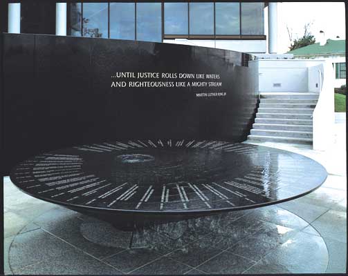
Civil Rights Memorial, Stone and Water, 1989
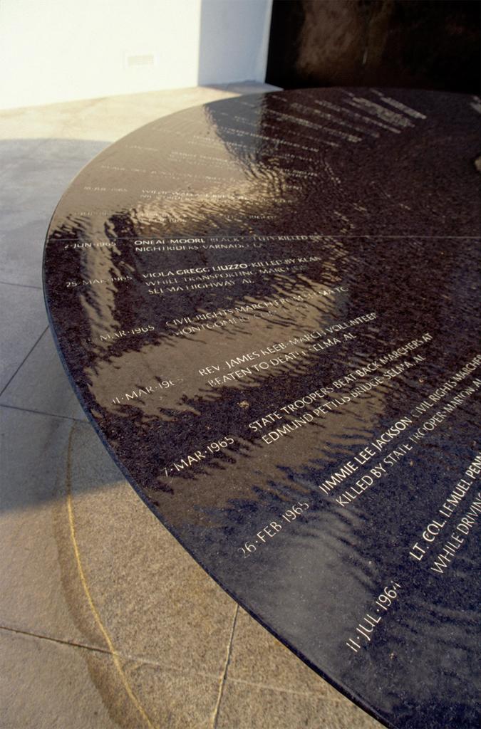
Civil Rights Memorial, Stone and Water, 1989
Not just an environmental artist, Lin’s studio works also reflect her love of landscape.

2 x 4 Landscape, Wood, 2006
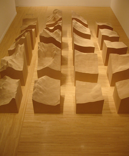
Blue Lake Pass, Particleboard, 2006

Water Line, Aluminum Tubing & Paint, 2006
Peace Chapel, Juniata College, 1988-89
Landscape is the focus of much of Lin's art, merging the technological advancement and style of modern day life with ideas of natural beauty. “Her works address how we relate and respond to the environment, and presents new ways of looking at the world around us” (http://www.mayalin.com/). Some of her pieces are partially or fully embedded in the earth, merging completely with the environment, blurring the boundaries between the natural and the synthetic.
Eleven Minute Line, Earth and Grass, 2004
An example of such works is The Wavefield at University of Michigan, which consists of tall, undulating waves made entirely of soil and grass, and the Vietnam Memorial, a V-shaped wall of black stone, sunken into the earth, etched with the names of 58,000 dead soldiers.
Wave Field, Earth and grass, 1995
Vietnam Veterans Memorial, Stone, 1982
Vietnam Veterans Memorial, Stone, 1982
Vietnam Veterans Memorial, Stone, 1982
Her Civil Rights memorial in Montgomery, Alabama displays inscriptions on a disc of black stone beneath a thin layer of moving water. On the disc are names of people who died in the name of civil rights and the dates of important events in civil rights’ history. Lin describes the piece in her book, Boundaries: “In choosing to intertwine events with people's deaths, I was trying to illustrate the cause-and-effect relationship between them. The struggle for civil rights in this country was a people's movement, and a walk around the table reveals how often the act of a single person -- often enough, a single death -- was followed by a new and better law.”
Civil Rights Memorial, Stone and Water, 1989
Civil Rights Memorial, Stone and Water, 1989
Not just an environmental artist, Lin’s studio works also reflect her love of landscape.
2 x 4 Landscape, Wood, 2006
Blue Lake Pass, Particleboard, 2006
Water Line, Aluminum Tubing & Paint, 2006
Museum Analysis 2: Idaho Historical Museum
The second museum I visited was the Idaho Historical Museum where I looked at the room displays. In particular, I looked at the M.C. Smith’s Bar exhibit which depicts a normal bar scene from the 1800s. This tries to give the audience a feel for what life used to be like.

The exhibit is housed at the top floor of the museum in a large, open room. It is sectioned off by a low, wooden slatted fence, which marks the end of the museum’s carpeted halls and the beginning of the bar’s worn wooden floor. A long mirrored bar lines one wall and a leather sofa and chair take up most of the other. The middle of the room houses a wood stove surrounded by chairs. The room is not bare, housing everything from books and mounted buffalo heads to oddities such as a two-headed calf and a cannon. Very little documentation is offered other than a pictured plaque, which describes where this bar was previously housed and the process by which bars in the late 1800s were purchased and transported. Additionally, small cardboard cards explain why the calf was included in the exhibit and describe the history of the “Samuel Tilden” cannon.

Unlike other exhibits, which feature items stored in sterile glass cases, this exhibit is artistically arranged to appear as though you are looking back at a specific moment in time. Details such as an old calendar and the inclusion of so many historic items like clocks, a phone, and historic furniture lend to the effect. Additionally, a tray of food and drink lay abandoned on the counter, as if it’s owner had just left the room a moment ago. Though most of the items appear to have a purpose for their inclusion, the cannon seems a bit odd to include. Its card describes the history of its donation, but gives not reason why it is housed in this particular exhibit. In this case, it seems that the museum simply felt the need to display the generous gift and this exhibit offered the only available free space.
I think it is an effective exhibit for its audience, which is likely to be primarily schoolchildren. As I was sitting next to the exhibit, two groups of 4th graders came by on their field trip, excitedly pointing out the two-headed cow and all the little details in the bar. For such an audience, fewer descriptive cards are necessary; visuals communicate more about the past. They are able to connect to a scene in front of them more than individual elements isolated in glass cases.

The last question I had when looking at the display was which elements were real and which were reproductions. Other than a few of the bigger items, none were labeled, so I had no way of knowing. For an adult, it might be more satisfying to know if items are authentic or not, but I suppose as long as the reproductions were true to the time period represented, in this type of display, that knowledge is not vital.
The exhibit is housed at the top floor of the museum in a large, open room. It is sectioned off by a low, wooden slatted fence, which marks the end of the museum’s carpeted halls and the beginning of the bar’s worn wooden floor. A long mirrored bar lines one wall and a leather sofa and chair take up most of the other. The middle of the room houses a wood stove surrounded by chairs. The room is not bare, housing everything from books and mounted buffalo heads to oddities such as a two-headed calf and a cannon. Very little documentation is offered other than a pictured plaque, which describes where this bar was previously housed and the process by which bars in the late 1800s were purchased and transported. Additionally, small cardboard cards explain why the calf was included in the exhibit and describe the history of the “Samuel Tilden” cannon.
Unlike other exhibits, which feature items stored in sterile glass cases, this exhibit is artistically arranged to appear as though you are looking back at a specific moment in time. Details such as an old calendar and the inclusion of so many historic items like clocks, a phone, and historic furniture lend to the effect. Additionally, a tray of food and drink lay abandoned on the counter, as if it’s owner had just left the room a moment ago. Though most of the items appear to have a purpose for their inclusion, the cannon seems a bit odd to include. Its card describes the history of its donation, but gives not reason why it is housed in this particular exhibit. In this case, it seems that the museum simply felt the need to display the generous gift and this exhibit offered the only available free space.
I think it is an effective exhibit for its audience, which is likely to be primarily schoolchildren. As I was sitting next to the exhibit, two groups of 4th graders came by on their field trip, excitedly pointing out the two-headed cow and all the little details in the bar. For such an audience, fewer descriptive cards are necessary; visuals communicate more about the past. They are able to connect to a scene in front of them more than individual elements isolated in glass cases.
The last question I had when looking at the display was which elements were real and which were reproductions. Other than a few of the bigger items, none were labeled, so I had no way of knowing. For an adult, it might be more satisfying to know if items are authentic or not, but I suppose as long as the reproductions were true to the time period represented, in this type of display, that knowledge is not vital.
Museum Analysis 1: Boise Art Museum
I first visited the BAM when assigned the museum analysis project where I looked at the exhibit Elegance of Form: Selections of American Art from the Permanent Collection. This particular exhibit showcases ceramics from many different artists and countries that were donated by John Takehara in 1994. Since that time, others have donated works that are also housed in the exhibit. The works appear to be intended for aesthetic appreciation above any other purpose.

The collection inhabits half of a small room with two glass cases embedded in the walls that join together at the corner to form an L-shape. Three free-standing display cases of varying sizes stand in the middle of the room to break up the open space. In the wall cases, ceramics are housed on glass shelves that are placed symmetrically: three columns of shelves with two shelves in the outer columns and one shelf in the center column. The light source comes from above where nine bulbs are diffused through a beige screen to create a bright yet still soft illumination of the works. The works themselves vary in size and shape. Most are vessels of some type: bowls, teapots, plates, or pitchers. Some of the glazes are glossy, others matte. Some even have a metallic sheen to them. At the base of the exhibit, small white placards describe each of the works displayed.

Harrison McIntosh, Bowl, stoneware, 1990 (from BAM)
The meaning of the exhibit seems to be a balance of appreciation for beauty and an appreciation of the man who started the trend of donations. Do to the location of the information on John Takehara (located subtly on the wall, right next to the entrance to the room where it could be overlooked), I would suspect that the curator’s focus was more on the works themselves and the aesthetic value they hold for the audience (normal Boise citizens) than about celebrating the donor. That said, I did just notice another picture/quote plaque on the wall that is spotlighted. This would show past and future donors that their contributions are appreciated and recognized. It would show them that by donating to the BAM, they would always be remembered.
Overall, it’s a beautiful, simple display of ceramics that allows the viewer to focus solely on the works themselves without being distracted by the display methods.
The collection inhabits half of a small room with two glass cases embedded in the walls that join together at the corner to form an L-shape. Three free-standing display cases of varying sizes stand in the middle of the room to break up the open space. In the wall cases, ceramics are housed on glass shelves that are placed symmetrically: three columns of shelves with two shelves in the outer columns and one shelf in the center column. The light source comes from above where nine bulbs are diffused through a beige screen to create a bright yet still soft illumination of the works. The works themselves vary in size and shape. Most are vessels of some type: bowls, teapots, plates, or pitchers. Some of the glazes are glossy, others matte. Some even have a metallic sheen to them. At the base of the exhibit, small white placards describe each of the works displayed.
Harrison McIntosh, Bowl, stoneware, 1990 (from BAM)
The meaning of the exhibit seems to be a balance of appreciation for beauty and an appreciation of the man who started the trend of donations. Do to the location of the information on John Takehara (located subtly on the wall, right next to the entrance to the room where it could be overlooked), I would suspect that the curator’s focus was more on the works themselves and the aesthetic value they hold for the audience (normal Boise citizens) than about celebrating the donor. That said, I did just notice another picture/quote plaque on the wall that is spotlighted. This would show past and future donors that their contributions are appreciated and recognized. It would show them that by donating to the BAM, they would always be remembered.
Overall, it’s a beautiful, simple display of ceramics that allows the viewer to focus solely on the works themselves without being distracted by the display methods.
Monday, May 9, 2011
Featured Artist: Jill Sylvia
Jill Sylvia’s medium is ledger paper, including some that her father used and discarded during his career as an accountant. Her work transforms 2D utility objects into beautiful 3D pieces that evoke a sense beauty within the businesslike repetition of her medium.

Untitled (U.S. Capitol Building), Hand-Cut ledger paper, dimensions variable, 2008

Untitled (U.S. Treasury Building), Hand-Cut ledger paper, dimensions variable, 2009

Untitled (U.S. Treasury Building), Hand-Cut ledger paper, dimensions variable, 2009
Using a single-edged razor blade held against a straight edge, she cuts away the tiny rectangles of paper from within the ledger pages' ruled grids, yielding lattices that evoke architectural facades and the constraints of everyday business routine.

Untitled (City), Hand-Cut ledger paper and matte board, dimensions variable, 2007
To prevent her works from becoming too monotonous, Sylvia inserts variation into her pieces by selecting sheets of different sizes — 4, 10, or 25 columns — and often attaching them together.

The resulting confetti of scraps are not wasted. They’re carefully collected and reassembled into textured collages such as "Untitled (Reconstruction Birds I)."
“The aesthetics of office supply design is reflected in the minimal palette available — green and brown on light green; blue and red on buff” (http://www.sfweekly.com/2007-06-13/culture/jill-sylvia-ledger/) In “Untitled (Calendar),” Sylvia mounts 31 yellow sheets on the wall like days in a month.


Untitled (U.S. Capitol Building), Hand-Cut ledger paper, dimensions variable, 2008
Untitled (U.S. Treasury Building), Hand-Cut ledger paper, dimensions variable, 2009
Untitled (U.S. Treasury Building), Hand-Cut ledger paper, dimensions variable, 2009
Using a single-edged razor blade held against a straight edge, she cuts away the tiny rectangles of paper from within the ledger pages' ruled grids, yielding lattices that evoke architectural facades and the constraints of everyday business routine.
Untitled (City), Hand-Cut ledger paper and matte board, dimensions variable, 2007
To prevent her works from becoming too monotonous, Sylvia inserts variation into her pieces by selecting sheets of different sizes — 4, 10, or 25 columns — and often attaching them together.
The resulting confetti of scraps are not wasted. They’re carefully collected and reassembled into textured collages such as "Untitled (Reconstruction Birds I)."
“The aesthetics of office supply design is reflected in the minimal palette available — green and brown on light green; blue and red on buff” (http://www.sfweekly.com/2007-06-13/culture/jill-sylvia-ledger/) In “Untitled (Calendar),” Sylvia mounts 31 yellow sheets on the wall like days in a month.
Subscribe to:
Posts (Atom)