Friday, March 25, 2011

Midterm!

For our midterm, we were assigned to create sculptures out of either soap or spam. Soap represented subtractive sculpture, which is when you take away part of an element to create the sculpture (like carving wood or stone). Spam, on the other hand, represented additive sculpture: the process of building up an object (like working with clay). You can add or take away from it as much as you'd like; the medium is much more malleable.

I chose soap, mostly because the thought of working with spam was rather unappealing, but started encountering problems as I carved. Eventually, I had marred my soap so much that it became unsalvageable. So what to do? Either I could start over with new soap or try something different.

Finding out that Ivory soap puffs in the microwave, I nuked my fragments until they puffed into huge clouds of foamy soap. Then, I crushed the foam and mixed with a little water, kneading until I achieved a very crumbly paste. Finally I started sculpting!

It was kind of fun turning a traditionally subtractive medium into an additive one, but in the end, my frog started crumbling pretty badly. As he dried, the legs started to break away from his body, and at one point he lost an eyeball. I was able to moosh him back together with a bit of softened soap, but let's just say the car ride to school was not a happy event....

My Fail Frog!


Wednesday, March 23, 2011

Featured Artist: Andy Goldsworthy

Andy Goldsworthy's work focuses on natural elements, using things like leaves, sticks, stones, snow, and other elements found in nature to create works of art that are often site-specific and incredibly temporary.


Goldsworthy works to not make a mark on the landscape in which he works but instead to incorporate his work so that it feels like a natural extension of its surroundings. He attempts to convey and enhance the power and energy he sees in nature.


Egg in the forest

Many of his works are temporary, existing only for a brief moment before collapsing or being worn away into the chaos or natural order that existed before.


Leaves polished, greased made in the shadow of the tree from which they fell, pinned to the ground with thorns, 1989


Broken Pebbles, 1985

Japanese-Maple-Leaves.jpg
Japanese maple leaves stitched together to make a floating chain, 1987

Thursday, March 17, 2011

Book Art Project

I forgot to really post anything about our book art project, which was supposed to be either to alter a book or to create a new artist's book. While searching for ideas, I saw these paper flowers on a blog, and knew instantly I had to incorporate them into my piece. Ultimately, I chose to alter a book instead of create a new one. Here are the results!


Artist's Statement:
To be honest, the intention behind this piece is mostly aesthetic. I love how the repetition of the flowers gives the piece a sense of unity, yet is not sterile due to the variation in size and petal number. Long vertical lines, created by the folds of the book, continue down to the base pages and draw the whole piece together. I love how the geometric shape of the book has transformed into organic shapes and arrangements yet is still recognizable, incorporating the old with the new. Still, even with this piece’s emphasis on simply the aesthetic, the concept of the work has a kind of lovely, cyclical quality to it. Pages made from trees were compiled into a horticultural journal, which now has “grown” this bouquet of flowers. Plants about plants became plants.

Wednesday, March 9, 2011

Describing Remedy

One of my 107 assignments was to write about a work of art that was featured on campus. I decided upon Joanna Cleveland's Remedy.

Cleveland_Joanna_Remedy
Remedy, Oil on canvas, acrylic on vinyl, fabric, 2010

Remedy
The Boise State Hemingway Center was completely quiet as I opened the door, my footsteps echoing loudly on the wood floor as I began exploring. Around me, the partitions were covered with all types of artwork from photos to paintings to a strange, corner sculpture that resembled sheets of putty that had been stuck together and pulled apart. Though I explored the Fresh Air exhibition to see everything it had to offer, I knew from the beginning which piece I was going to write about, having seen an image of it in class the day before.

Joanna Cleveland’s Remedy hung near the back of the exhibit, an unframed, multilayered, 24”x24” canvas square. The painting is intriguing because it combines different mediums. The first layer is canvas, on which she has used oil paint to depict organic, flower-like images and long lines that stretch from one end of the plane to the other. These lines are useful in creating directional forces that draw the viewers’ eyes across the plane. On top of this layer, are some vinyl cut outs that have been painted with acrylic. These shapes, though I believe nonrepresentational, reminded me of slices of oranges or some other strange fruit. Finally, everything is covered in a light, filmy gauze. The interplay of actual textures such as the soft fuzziness of the gauze and the shiny, plastic coating of acrylic creates a beautiful contrast.
The painting’s sense of depth comes primarily through the use of overlap, both literal (in the case of the different layers of materials) and depicted. Light logic only seems to come into play on the canvas level where Cleveland uses modeling to create depth within the folds of the flower-like images.
It is an open piece, with the figures extending beyond the border of the painting. Positive shapes dominate the plane, crowding out much of the negative space, yet still, there is enough of a balance that the work does not seem crowded. The repetition of shapes and continuation of lines across the picture create a sense of unity.
Because of the beige background, I’m not sure if the work’s color scheme could be considered completely analogous or not, but primarily Cleveland uses deep red-violet for her flower-like shapes in the background, bright peach and orange for her vinyl shapes, and a light pinkish gauze on top. Other than the pink gauze, all the colors are opaque. It is appropriate that the lower layers are cooler in color since warmer colors reach out of the picture plane and appear closer than cooler colors.
Though all these elements work together to create an aesthetically pleasing work, I still wondered at the piece’s meaning. The shapes do not seem to be representational, so their intention is not immediately clear. Ultimately, I formed my opinions from the work’s title, Remedy.
The orange, fruit-like shapes reminded me of microorganisms that you would see under a microscope. Similarly, the purple flower-like shapes could also be seen as microorganisms or (if you interpreted them as flowers) could be symbolic of old apothecaries and the herbal remedies they provided. Since the shapes appear to “float” in and out of the plane, I saw the gauze as being the film in which germs float (gross, I know). Thus I saw the piece as wanting to find the beauty in medicine, turning the “beauty” of finding cures and saving lives into a tangible, beautiful image.
Or maybe I’m trying too hard to find meaning. Overall, the softness of the piece and long flowing lines create a sense of relaxation. Perhaps the remedy it provides is simply the happy endorphins that it creates in its viewers as they look at it.

Tuesday, March 8, 2011

Molotov Man Essay

Molotov Man
The identity of Molotov Man has changed over time from a representative symbol of his country’s revolution to a symbol of the struggle between ownership and artistic freedom. He first appeared as the subject of a photograph in Susan Meiselas’s series, Nicaragua, in 1979, but reached greater fame after Joy Garnett painted his image for her Riot series in 2003. Because of its dramatic changes in meaning, Molotov forces its viewers to consider the way a work’s interpretation is altered as it is taken further and further from its original context.
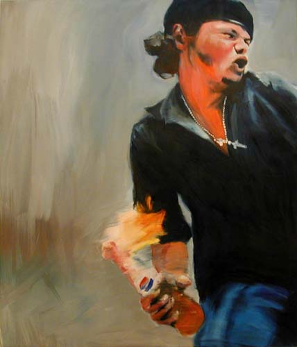
In his original photo, Molotov is seen throwing his bomb at a Somoza national guard garrison, the figures and objects around him giving some form of context to the work. Meiselas is careful to preserve context, hoping to respect her subject’s individuality. In this particular case, she wanted to capture the exact moment that the Somoza fell from power and the Sandinistas took over (Garnett and Meiselas 56-57).
 
(Nicaragua by Susan Meislas)
Molotov’s image was used by many different organizations over the years, such as by the Nicaraguan Catholic Church in their tribute to a Jesuit priest that died fighting against Somoza rule or in the case of the Sandinistas themselves, who used the image to embody their cause and encourage men to join the militia. Even the Sandinistas’ enemies, the Contras, used the image as they pleaded for support from the United States. Still, in all these uses there is still a link to the original context: revolution in Nicaragua (Garnett and Meiselas, 57).
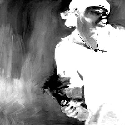
That link was severed when Joy Garnett painted the picture of Molotov in 2003. Her approach to art was very different from that of Meiselas. Garnett searched for pure, extreme emotion that was detached from any particular context. She even went as far as saving the images she wished to paint on her computer until she could no longer remember the narrative that accompanied each photo. Her work was about aesthetics alone. In the case of Molotov, background imagery was stripped away and the focus was turned to the man himself and his intense expression (Garnett and Meiselas, 53).
 
(Molotov by Joy Garnett)
This lack of context upset Meiselas, who threatened a lawsuit against Garnett for using her work without permission. As word spread about the struggle between the two artists, Molotov gained his third major meaning/context: the symbol between ownership and artistic freedom. Many artists around the world reproduced Molotov, in an act of solidarity against the idea of exerting control over artists’ use of imagery (Garnett and Meiselas, 54-55).
 
(tinjail after joy by Michael Sarff)
 
(Molotov Landscapes by Edward Tang)
An example of such an act of solidarity is Liz Sabater’s Joywar: The Distorted Molotov. You can hear the heat in the supporter’s voice as she describes the situation: “Joy Garnett’s Riot show are oil paintings of images sampled from newswires and other public news media. Now she is not only being sued by the photojournalist whose picture was sample in MOLOTOV but she is being asked to never show and never sell the artwork. This is obviously not a case of an artist protecting his speech rights but of one artist using his copyrights as a way to censor another artist. A sad case of Stockholm Syndrome if there ever was” (Sabater).
 thedistortedmolotov.png
(Joywar: The Distorted Molotov by Liz Sabater)
Molotov Man has had three identities: a symbol of rebellion, an example of human emotion, and a symbol for artistic freedom. In each case, his meaning grows further from its original context. The question becomes for us, does this matter? Do artists have a responsibility to preserve the original context of an image or idea? Additionally, do they have the authority to determine other’s use of an idea? There are no simple answers to these questions.

Works Cited
Garnett, Joy. Molotov. 2003. Debs & Co., New York.
Garnett, Joy, and Meiselas, Susan. “On the Rights of Molotov Man.” Harper’s Magazine. Feb 2007: 53-58. Print.
Meiselas, Susan. Nicaragua. 1979. Web image. Magnumphotos.com. 5 March 2011.
Sabater, Liz. “Joywar: The Distorted Molotov.” Culturekitchen.com. n.p., 5 March 2004. Web. 5 March 2011.
Sabater, Liz. Joywar: The Distorted Molotov. 5 March 2004. Web image. Culturekitchen.com. 5 March 2011.
Sarff, Michael. Tinjail after joy. n.d. Web image. Tinjail.com. 5 March 2011.
Tang, Edward. Molotov Landscapes. 2004. Web image. Antiexperience.com. 5 March 2011.

Friday, March 4, 2011

Featured Artist: Marc Quinn

Marc Quinn’s sculpture, paintings and drawings often address the relationship that people have with their bodies. He uses many different materials from traditional marble to more experimental mediums such as blood or feces in order to convey paradoxes that help to define who we are. The spiritual and the physical, cultural and natural, cerebral and sexual--all these things are addressed in his works.


Self, blood, 1991


Self is probably Quinn's most famous work, an ongoing self-portrait that he redoes every five years. The heads are made of Quinn's own blood, representing the intimate connection he has with his work.


Allison Lapper, marble, 2005

Another of his works was a sculpture of Allison Lapper, a woman with no arms and truncated legs. The marble statue depicts the woman naked and very pregnant. For a time, it was featured in Trafalgar's Square, a testiment to feminine strength alongside Nelson, a figure of traditional masculine power.

Other works are daring, challenging society's views of normality and attraction.

British artist Marc Quinns solid gold sculpture of British supermodel Kate Moss at the British Museum in London, Britain, 02 October 2008. Quinns 50kg solid gold statue of Moss in yogic pose was unveiled to the public for the first time 02 October. Siren, a GBP1.5 million (1.9 million Euros) solid gold sculpture, is one of several contemporary sculptures in the exhibition Statuephilia.  EPA/ANDY RAIN
Siren, solid gold, 2008