Monday, February 7, 2011

Featured Artist: Nina Katchadourian

Nina Katchadourian's works encompass many different media including photography, sound, video, sculpture, and mixed media projects. She addresses and changes familiar systems by offering unlikely observations, intervening with natural processes, or "improving" objects. Examples of this are her sorted books, talking popcorn machine, and mended spiderwebs.

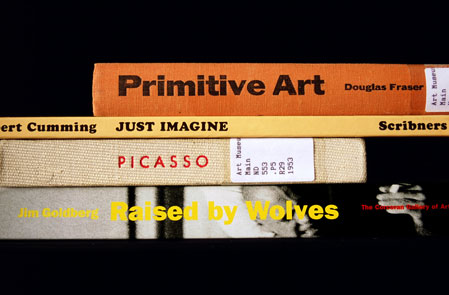
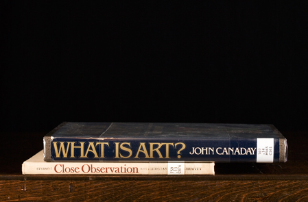
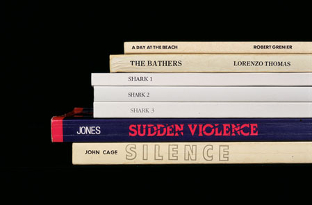
Since 1993, Sorted Books has been an ongoing project in which Katchadourian goes to public or private libraries and pores through the collection of books, searching for ways to group books together. The books are arranged top down or left-to-right, their titles revealing thoughtful ponderings or clever jokes.


Akron Stacks from the Sorted Books project, C-prints, 2001

The groupings are clever in their own right, but additionally they serve as a commentary on their library's collection, revealing patterns, trends, or inconsistencies in the holdings.


Special Collections Revisited from the Sorted Books project, C-prints, 1996/2008

Beyond being linked conceptually, the visual repetition of the books and the steady staccato rhythm of titles unifies each grouping into its own comprehensive unit.


Shark Journal from the Sorted Books project, C-prints, 2001

Talking Popcorn is a sound sculpture that records the sounds of popping popcorn as Morse code and translates it into words, which are then spoken aloud and documented in a journal. The piece plays with the ideas of language and interpretation, challenging viewers to find patterns of communication even in silly, everyday objects and actions.


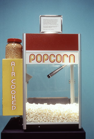
Talking Popcorn, Concession stand popcorn machine, microphone, laptop with custom-written Morse Code program, printed paper bags, 2001

In addition to the machine itself, each day's speech is displayed with packets of the popcorn that dictated them.


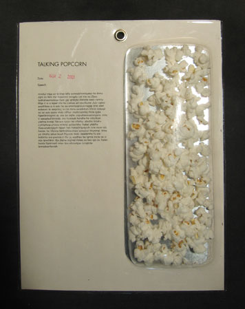
The Popcorn Journal, Vacuum-formed capsules with popcorn, printed paper and ink stamp, 2001

Also, Katchadourian chose to bronze the first pieces of "talking popcorn" along with a placard that shows the popcorn's very first word, "We."


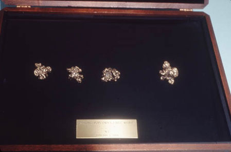
Talking Popcorn's First Words, Bronze popcorn kernels in velvet-lined wooden box, 2001

One of Katchadourian's most famous works is likely her Mended Spiderweb Series. In 1998, she set out to repair broken spiderwebs around her home with nothing but some red thread and starch or white glue to stiffen/secure some of the longer pieces. She would work on the webs until either they were fully repaired or could no longer sustain the weight of her additions.


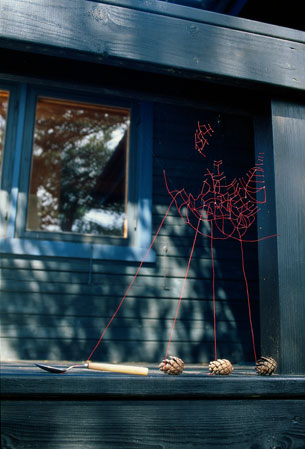
Mended Spiderweb #14 (Spoon Patch), 1998

Her works are fascinatingly not only for their intricacy, but also for their sense of impermanence. Beyond the typical short life of an outdoor spiderweb, her particular additions are even more short-lived due to the spiders' rejection of her work. Often she would return to the site of her webs to discover that the spider had replaced her threads with its own.


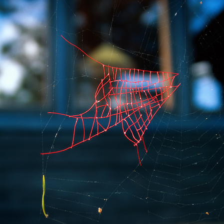
Mended Spiderweb #8 (Fish Patch), 1998
In addition to simple repairs, Katchadourian made sure to include a taste of her humor, as can be seen in her "attempt to teach spiders marketing," as seen below.


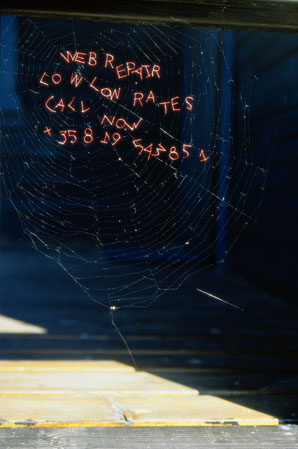
Marketing Tips for Spiders, 1998

Saturday, February 5, 2011

Finished Wire Sculpture

Woot Woot!!! It's all finished! I ended up going with little strips of nylon tights pulled between layers of the spirals. Am pretty happy with the way things turned out. Also, this is it for playing catch-up! From now on, my blog posts will likely not be nearly as prolific.


Artist's Statement:

This work represents much of the way I approach creating art. There is an order to it in the geometric shapes of the triangles and the unending circles that spiral around the frame. As I work, I try to draw order out of chaos yet still allow part of the work to build itself. The curve of the spirals, the varying shapes of the skin—these all show places where I gave up control and just let the piece build itself. Sometimes this lack of control resulted in imperfections, places where I began working only to discover that my ideas were flawed or at least not right for the piece. There are scars from ideas that never came it to fruition: burn marks from failed soldering attempts, random scraps of glue that I couldn’t quite scrape away. But these imperfections are what makes it unique and gives it an organic quality.

I found inspiration for this piece in architecture, yet my end result seems almost nautical. I love how the white fans spiral around the base rods, like sails on a ship. Even the shape itself is reminiscent of a sailboat.

Finally, I chose the name Ambition for this piece because it shows the hopes I have for my future works. The rods that form the triangular base are sturdy, representing the foundation of my learning. My intention in using spirals as a main feature of this piece was to give a sense of growth; as if left on its own, it might continue to grow beyond the frame it currently relies on. And someday that is what I hope to do as well.

Featured Artist: Jeff Koons

Of all the kitsch artists, Jeff Koons is perhaps one of the most famous. Koons studied painting at college, and worked as a commodities broker while making a name for himself as an artist. An interesting aspect of Koon's work is that he does not construct his pieces himself. Instead, he supplies ideas to a staff of artists who then work to transform his ideas into actual works of art.

His works do not attempt to have any hidden meaning; instead, their meaning lies entirely within the viewer's first impression. He once stated, "A viewer might at first see irony in my work... but I see none at all. Irony causes too much critical contemplation."


Koons's work is often defined as Pop Art, a movement that mocked the established art world by using images from the street, popular culture, or mass media and presenting them as art. It put art into terms of everyday life. Nothing was considered too common to be art. This blurred the distinction between "high art" and "low art" and allowed commercial art methods to be considered on par with fine art methods.

JeffKoons_Popeye_email.jpg
Popeye, Oil on canvas, 2003
Examples of Koons's use of everyday objects or pop icons can be seen in his balloon animal sculptures and his piece Michael Jackson and Bubbles.

Balloon Dog (Yellow), high chromium stainless steel with transparent color coating, 1994–2000

Koon's series of balloon sculptures captures the trivial playfulness of a child's plaything and exalts it as fine art. Increasing the scale lends the piece a sense of importance, and making it out of metal implies a permanence, something completely opposite the represented object's natural state. In keeping with his theme of using everyday objects, Koons uses stainless steel, an industrial, common metal, to create his works, not a more traditional, "elitist" metal like bronze.

Michael Jackson and Bubbles, porcelain/ceramic blend, 1988

Many times, Koons has stated that he wishes his art to reach as wide an audience as possible, which he does by picking popular, contemporary subjects. This highly representational sculpture of Michael Jackson shows the blending of fine art with popular culture. The figure is life-sized and liberally applied with gold leaf, traditionally used to highlight things of importance or great worth.

But in addition to being simply a Pop Art figure, Koons takes things to the next level: kitsch. Kitsch prides itself in evoking reactions by featuring things that are considered to be in "bad taste." Good examples of Koons's kitsch are included below.

Woman in Tub, porcelain, 1988

Ushering in Banality, polychromed wood sculpture, 1988

Pink Panther, porcelain, 1988

Friday, February 4, 2011

Thought of You--A Video

I absolutely adore this video. The fusion of music and art is stunning. I love how the artist uses modeling to indicate the difference between reality and dream. Shadows not only add depth and make the figures seem more realistic, they also serve a narrative purpose within the story.

Watch it; I think you'll like it. :)

Wire Sculpture Progress

So here's how it's going so far:


Not too shabby! Overall, the frame is pretty sturdy. In addition to wrapping wire around the joints to secure them, I coated each one in super-strength glue. This was both good and bad, as you'll see later.


The only trouble is deciding where/how to attach the skin.....


The wire spirals are a bit off-center around the triangular frame, but since they're only attached to one post in the front and one in the back, there's not much I can do to correct it.


So here is the trouble with the glue. On one hand, it works great; all the joints are now secure and the wires don't slide around on the frame anymore, which is AWESOME. The only trouble is, I didn't quite realize how the glue would foam up as it dried. Nor did I realize how long it would take to dry and how oozy it would be until it did. So, I ended up with long foamy globs of glue running down the length of all the rods and coating each joint in an ugly semi-transparent/yellow-tinged blob. By the time I discovered the mess, it had dried too much for anything to be done, so I let it harden completely. Thus I spent the better part of my afternoon taking a box-cutter and scraping away hardened glue. The joints are still a bit ugly, as you can see above (I did scrape a bit more after taking the pic), but not bad.

Now to figure out the skin....I've been experimenting with ribbon, paper towels, tissue paper, and normal fabric, but haven't been able to come up with anything satisfactory so far. 

Featured Artist: Fritz Liedtke

Fritz Liedtke is a photographer from Oregon who has created a project on eating disorders that has gained much recognition. His work is daring in the unwavering way it presents the darker sides of self love and self hate. Since I was lucky enough to have access to part of the exhibition at BSU, I went for a visit.

Walking up the steps of the Student Union building, I began to hear the faintest hiss of whispers, growing louder as I made my way towards the Skeleton in the Closet exhibition, a series of intimate portraits by artist Fritz Liedtke, porying those who struggle with the secrets of anorexia and bulimia. In a way, the whispers set the scene, eerily telling the tales of the people portrayed in the photographs. Snatches of story would break through the hum of surrounding people, as if you had accidentally stepped in on an intimate confession.


Intimate confession: though color and focus would vary from piece to piece, this was the unifying theme of so many of the project’s portraits. I was struck by the wide age range represented (the youngest I can remember was 13) and the inclusion of both genders.


Due to the general sadness of the project, many portraits had subdued colors with dark shadows. But not all followed this pattern. Some, usually the pictures of those who had reached a further stage of recovery, were brighter or had optimistic or empowered poses.


Still, my favorite of the portraits and the one I thought most embodied the spirit of the project, was that of Katie. Nestled in the center of criss-crossing bars of playground equipment, the girl lay curled in a fetal position. The dark brown bark and steely blue-grey bars that surround visually reflect the coldness that she sees in the world around her, caging the bright, floral sundress that represents her heart.

Perhaps one of the reasons I found the portrait so striking was the combination of geometric and organic shapes and the vivid use of line. The girl’s shape is organic, natural, but the playground bars around her form perfect rectangles that create an intricate frame. The stark contrast between shape types is visually striking. In addition to this contrast is the strong use of line. While all the bars frame her, the four main posts run from the portrait’s edges straight down to the girl. These actual lines effectively draw your attention straight to the heart of the picture: Katie.

Beginnings of the Wire Sculpture

After finally deciding on the tower w/spiral, I set out for supplies. In the end I got three 1/4" steel rods, and a coil of 14 gauge steel wire. Totally forgot to take pics, but they looked something like this:
To start out, I stuck two rods in a vice and pulled until I got the angle I wanted. Then, to create the slight swoop of the front piece, I bent the rods around a car tire. The third rod was cut in half and also bent before being attached to the other pieces to create two identical triangles. Kind of like these drawings, but the top is not so rounded. Definitely more a triangle shape.


Originally, I had hoped to solder the pieces, but after some unsuccessful attempts, I discovered that steel does not work with silver solder. So I resorted to wire-wrapping instead. I attached the triangles at the top point and at the center of the bottom cross bar.
From there, I went about attaching the wire coil to the post legs with little wraps of wire. This worked well, except that the wire tends to slide up and down the rod, messing up the spiral. I'll probably have to resort to glue eventually.